Project summary
Giving Back: The Soul of Philanthropy is a cultural exhibition celebrating Black philanthropy, history, and the traditions of giving within communities.
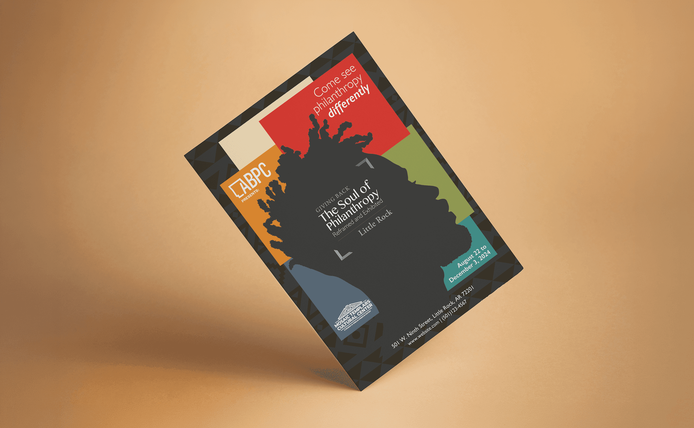
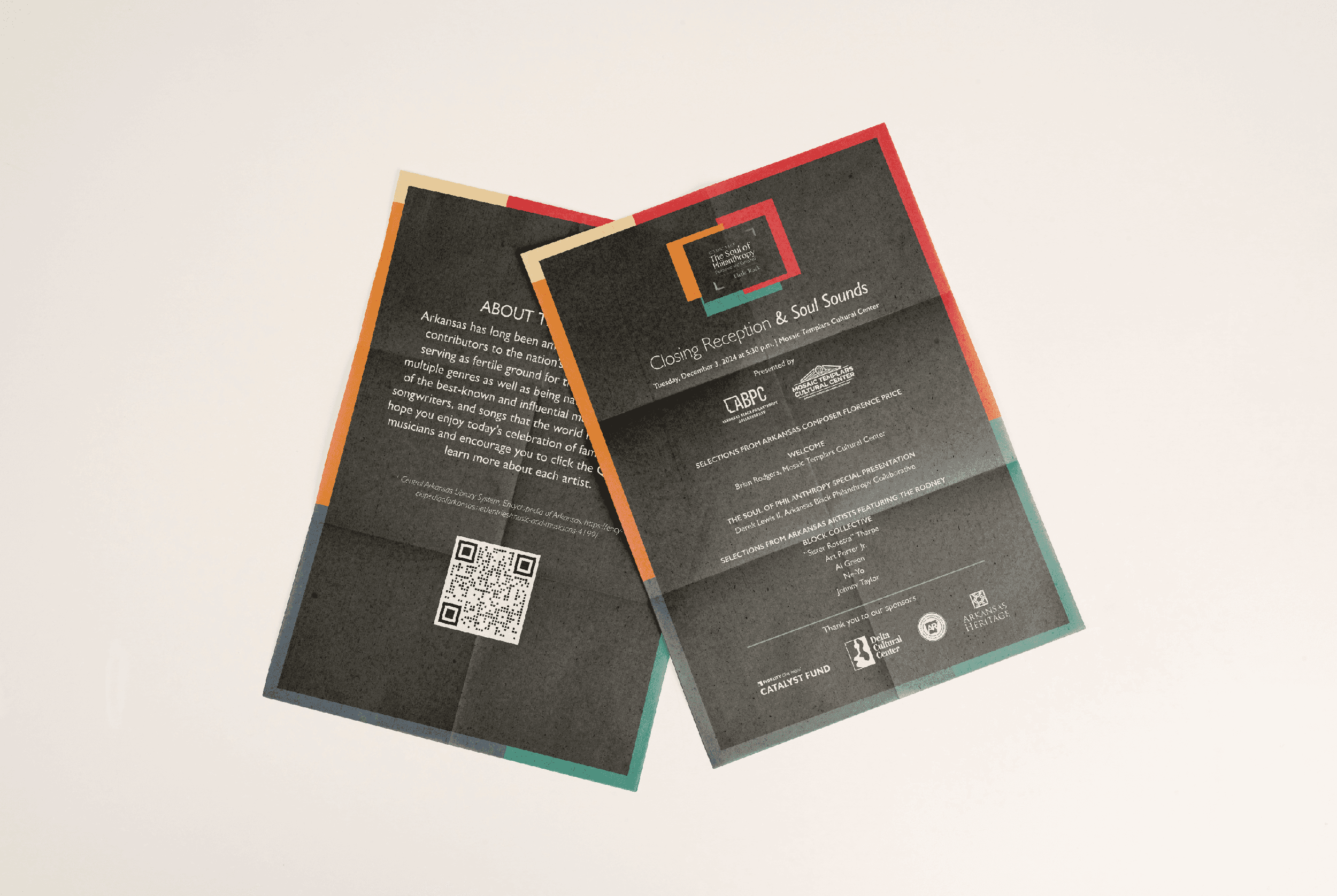
S&J developed a visual identity and campaign system that brought together cultural references, contemporary design, and a flexible approach to communication. The identity extended across print, digital, and physical materials, creating a recognizable visual language for the exhibition and its surrounding activities.
The challenge
An exhibition about Black philanthropy carries a story larger than the event itself. It connects cultural history, community generosity, and the people whose contributions have shaped that history.
The client wanted a visual direction inspired by African textiles, cultural patterns, and silhouettes representing different shades of Blackness.
The challenge was to honor those references without relying on predictable visual treatments or reducing cultural identity to decoration.
The exhibition also required more than a single promotional piece. Its identity needed to work across different formats, from event materials and social media to merchandise, while maintaining a consistent presence.
Our approach
We began by exploring how heritage, representation, and contemporary visual design could coexist within one identity.
Three creative directions investigated different ways of expressing the exhibition’s themes. One explored structured editorial compositions. Another developed a visual language around quilts, geometric arrangements, and layered patterns. A third focused on silhouettes, gradients, and references to cultural heritage.
Rather than selecting one concept unchanged, the client identified elements from two directions that resonated with the exhibition’s vision.
Those choices informed a combined visual system built around expressive color relationships, layered geometry, silhouettes, and quilt-inspired compositions.
Typography provided structure and clarity, while patterns and graphic elements introduced movement, energy, and opportunities for variation.


The solution
The resulting identity brought together cultural references and contemporary graphic design in a system that could adapt to different communication needs.
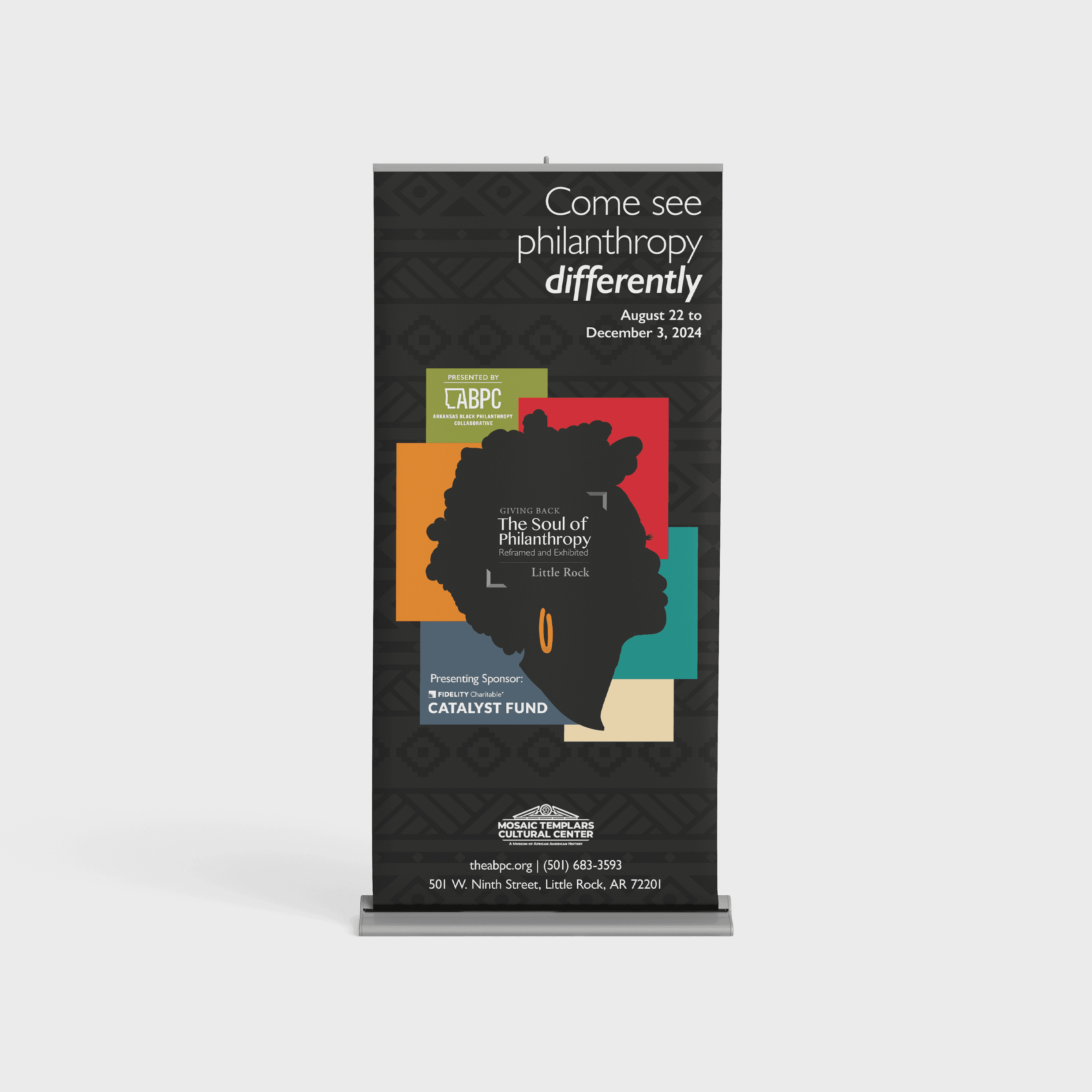
Quilt-inspired compositions and geometric patterns established a recognizable visual language. Layered silhouettes introduced a human element connected to the exhibition’s themes of representation and community.
Color, typography, and reusable graphic elements created consistency without requiring every application to look identical.
The system extended into event collateral, printed materials, social media graphics, editable Canva templates, and merchandise.
Rather than treating each piece as a separate design assignment, the identity provided a shared foundation for the exhibition’s communications.
Results / impact
The project received recognition in the 2024 GDUSA American Graphic Design Awards.
Beyond the award, the work established a flexible visual identity that could support the exhibition across multiple formats and touchpoints.
The project demonstrates how an identity can do more than promote an event. Through thoughtful visual decisions, it can become part of how an exhibition communicates its cultural story and connects with its audience.